New Carlisle City Rebrand
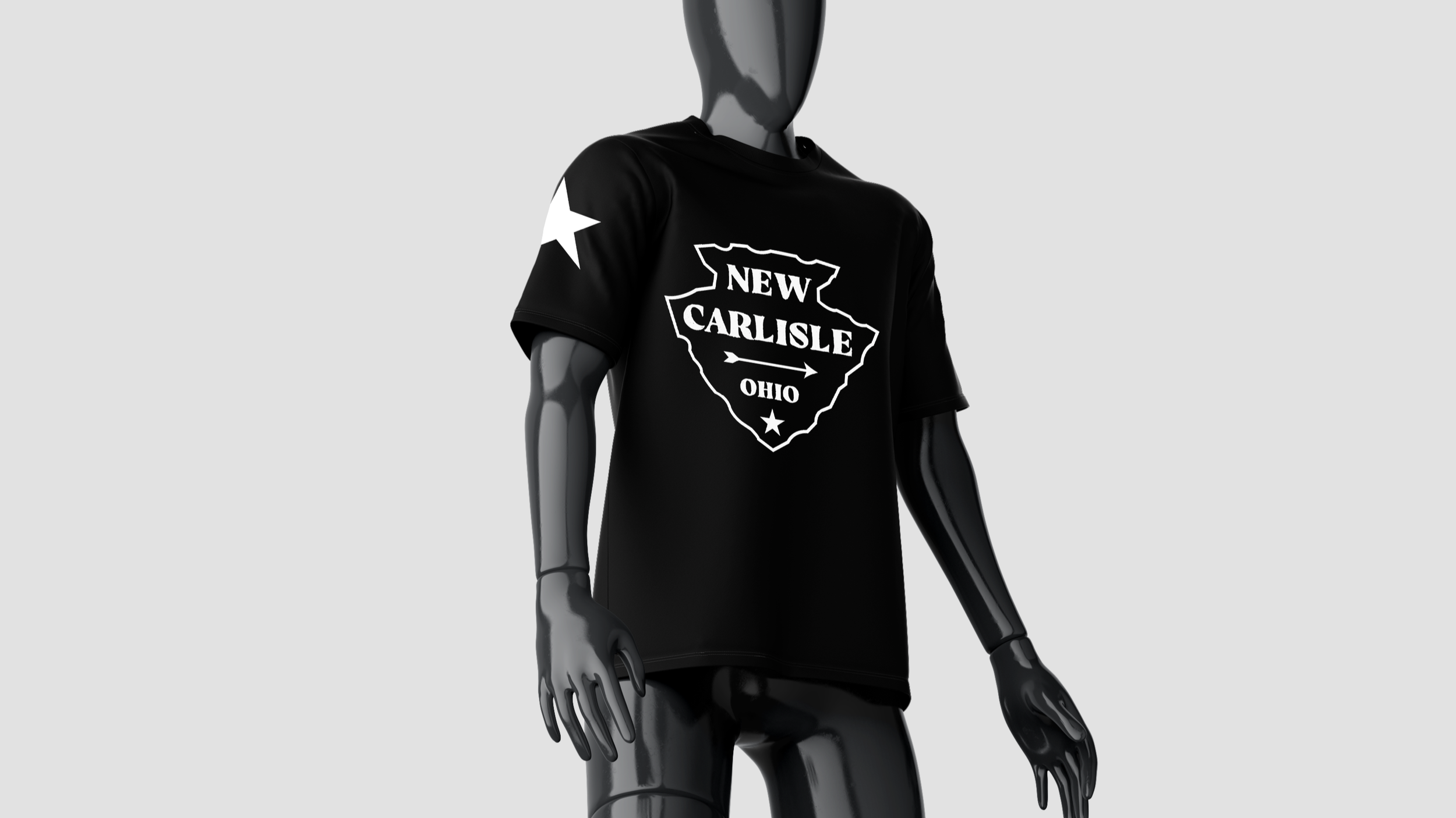
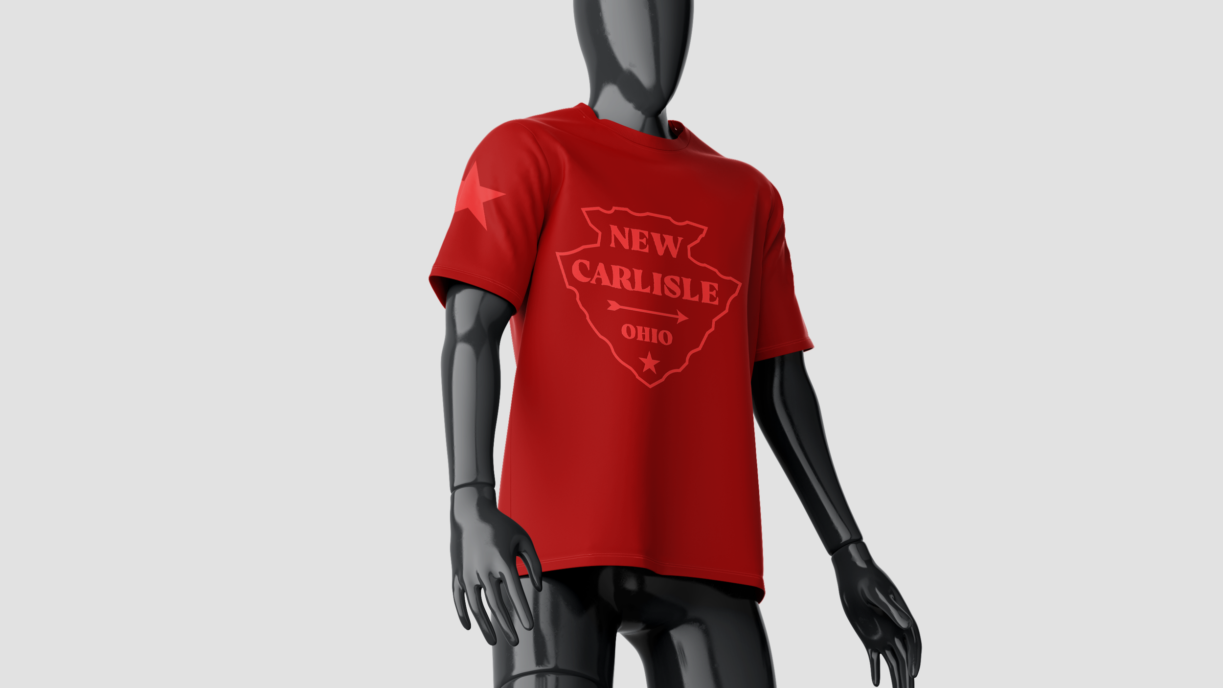
I chose to rebrand New Carlisle because it’s my hometown, and I understand its character. The original
logo felt cluttered, so I simplified it by placing the city name on an arrowhead, symbolizing both the town’s
history and school spirit for the Arrows. I used a rustic, western-inspired color palette and typography to
reflect its small-town charm while blending tradition with a modern touch.